After almost 15 years, we’ve decided it was time to (Re) Balance Me!
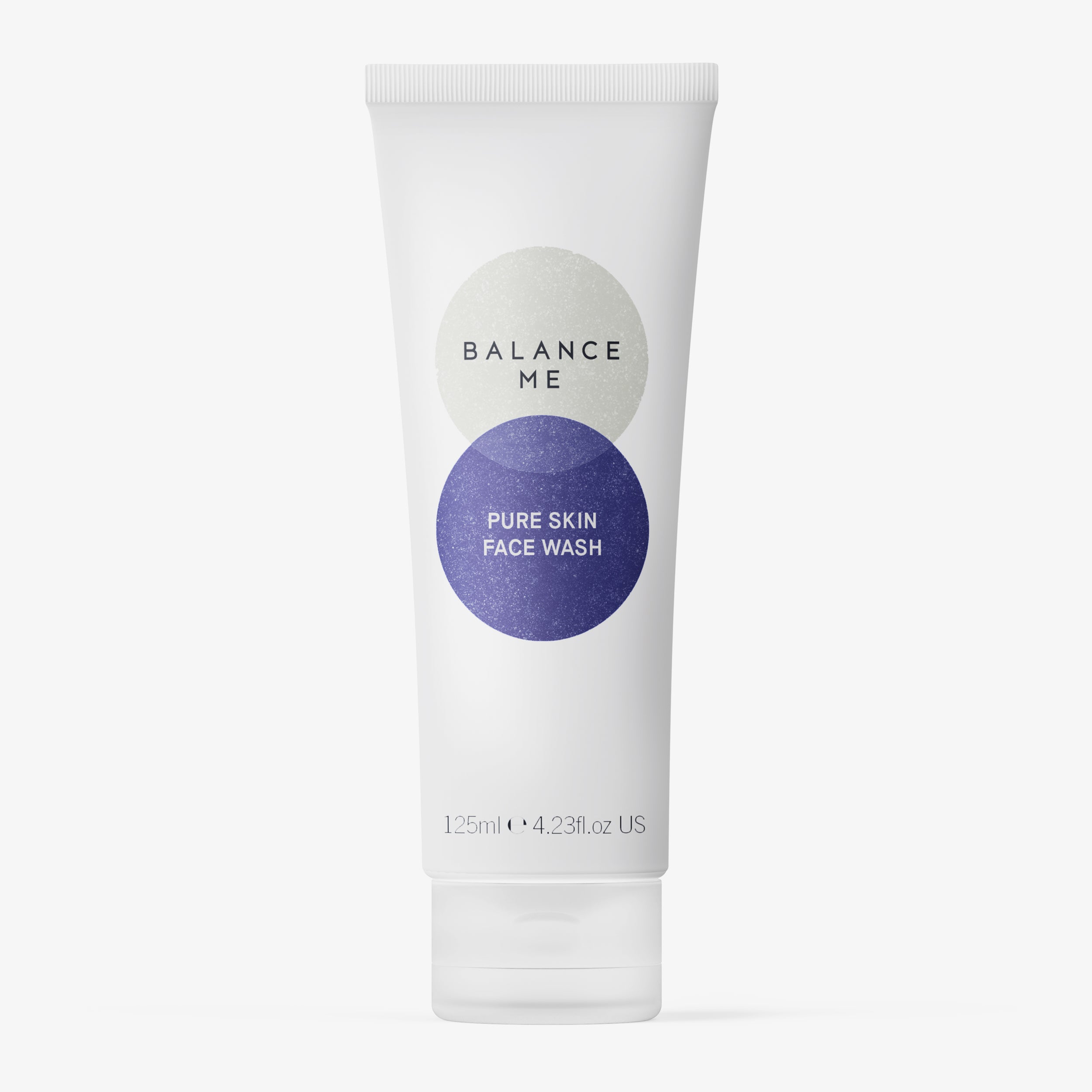
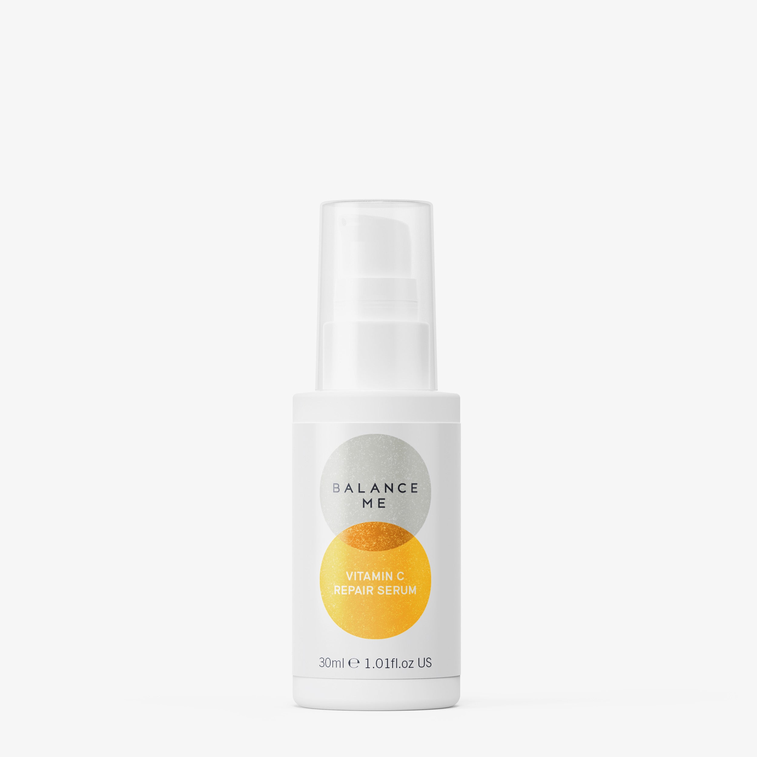
At the very heart, our redesign incorporates two, vertically overlapping circles that represent two elements coming together: the founding sisters, nature + science, work + life, physical results + daily wellbeing. Everything about the design is perfectly balanced, even our new logo is reminiscent of a weighing scale with the central point running through the ‘A’.
The subtle use of texture and earthy pigment inspired colour palette communicate our natural roots complementing the clinical white space – referencing the precision and technical detail that result in our product efficacy.
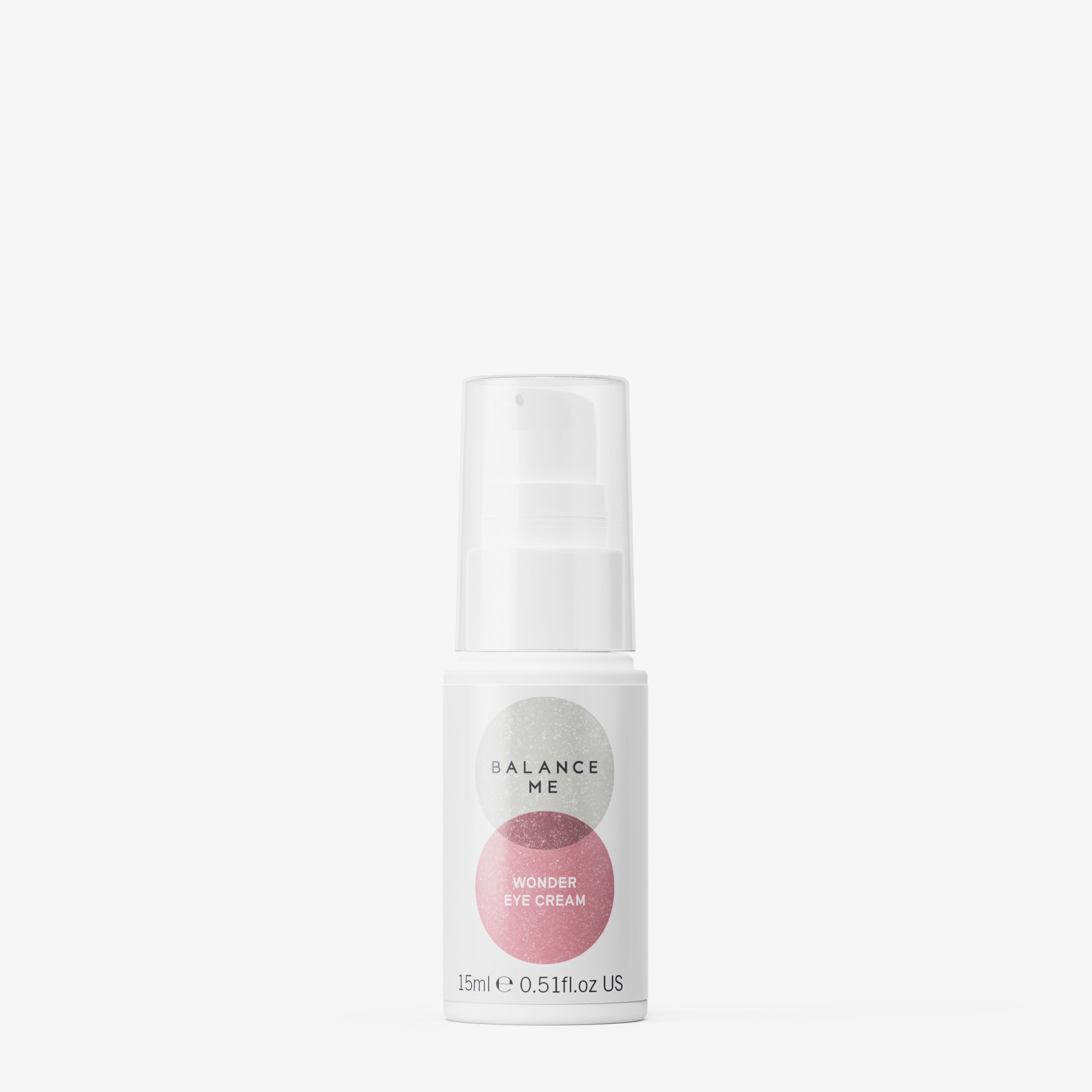
Our packaging is designed to walk our customer through each products skin benefit, highlighting new categories and our hero bio-active ingredients. We also wanted simplify the often confusing skincare routines, so we have recommended a perfect partner on every product.
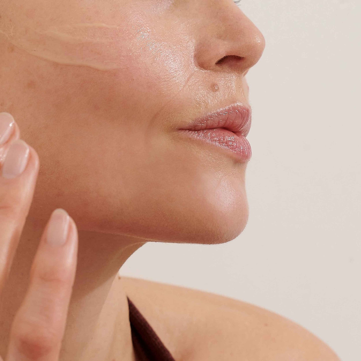
We may look different on the outside, but rest-assured, it’s still our award-winning natural formulations on the inside. We are still made in Britain, still cruelty free and are still honestly natural. We are so passionate about being honestly natural that our percentage natural is on the front of every product.
We wanted to be transparent on our recycling principles so together we can help minimise the impact on our precious environment. We are on a mission to address the sustainable 6: Re-Use, Remove, Reduce, Replace, Recycle and Renew. On every product you will find clear recycling guidelines, and we have introduced more clear glass alongside PCR (post-consumer recycled) plastic.
We really hope you love our new look as much as we do.
Rebecca + Clare